How Jacquard Weaving Creates Colour from Warp and Weft

A coloured jacquard tapestry builds its image from interlaced yarns. The weave determines which warp and weft colours are visible at the surface, so the finished colour depends on both the yarn palette and its arrangement. Printing places dyes or pigments onto an already formed fabric. These routes translate the same artwork differently.
For our oil-painting-style tapestry patterns, we normally use six warp colours: red, green, blue, yellow, black and white. Those six colours can contribute to many visible tones. Understanding how they interact makes it easier to judge a woven interpretation of painted light, shadows and fine detail.
What are warp and weft yarns?
Warp yarns run lengthwise through the cloth; weft yarns pass across them. On the loom, the warp is held under tension while successive weft insertions build the fabric. Warp direction is a manufacturing direction: it does not necessarily run from the top to the bottom of a finished wall hanging, because the piece can be cut and displayed in a different orientation.
Look at the blue and tan yarns in the first diagram. Each crossing has one yarn above the other. Following a blue yarn shows it passing over a tan yarn, then under the next. That alternating example is a plain weave, used here to make the crossing easy to see.

A tapestry uses more elaborate interlacing arrangements than this teaching example. The essential idea remains the same: yarns cross, and the arrangement determines what you see on the face.
How does a jacquard loom build the picture?
Jacquard control changes the interlacing across the design. Selected warp ends are lifted as a weft is inserted. Repeating that process places different yarn segments on the face in different areas. A weave plan records these over-and-under relationships; it is more than a coloured image sent directly to a machine.
A yarn segment that passes over several crossing yarns before binding down is called a float. Changing the placement and length of visible segments changes the contribution of each yarn colour. Longer floats and different bindings also change the surface, so colour development and fabric construction have to be considered together.
Yarns that are less visible in a particular area still belong to the fabric. Depending on the construction, they pass below other yarns or contribute more to the reverse or internal structure. They do not disappear from the cloth. The reverse may therefore look quite different, without being a second identical copy of the picture.
How can six warp colours create more than six visible tones?
Six warp colours describe the yarn palette, not the number of colours a viewer can perceive in the finished tapestry. They also do not mean that the entire cloth contains only six warp yarns. Many yarn ends make up the width of the fabric.
There are two parts to the colour effect. First, the weave controls how much of each warp and weft colour is exposed. Second, neighbouring coloured yarn segments are viewed together. Close up, you can distinguish the fragments; from farther away, they can read as a combined tone. This is often called optical colour mixing.
In the next diagram, compare a pale area, a warm area and a dark area. The same six illustrative colours appear in different proportions. The maps isolate the visibility principle; they omit the weft and structural bindings, so they are not loom-ready weave plans.

Our six-colour warp is only one part of the setup. Weft colour also contributes to the result. Yarn thickness, surface character, density and the complete interlacing affect what remains visible. A different weft or weave can change the appearance even when the six warp colour names stay the same.
The colour count does not establish an unlimited gamut or an exact match to every digital colour. Nor does a simple screen blend of six RGB values predict the woven result. The yarns reflect light as a textured surface; they are not six light-emitting pixels or six liquids mixed together.
What does colour building look like during weaving?
These frames from two of our workshop videos show the process and the woven surface. In the first, follow the yarns approaching the fabric edge, then look at the plant shapes emerging below it. The second video shows a woven piece spread out for a closer view.


In the second frame, compare the dark leaf outlines with the pale and blue-green areas around them. Their separation keeps the botanical image readable. An oil-painting-style design needs the same attention to local contrast: a highlight, a shadow or a garment fold must remain distinct after translation into yarn.
For a closer view of another sample, the folded mural detail below comes from our jacquard tapestry and wall-hanging page. Small yarn fragments are visible within areas that read as broader blue, brown or pale passages from farther away.
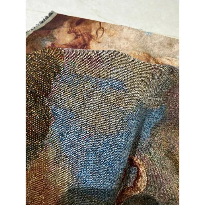
The video frames and mural photograph show real woven material. They are not calibrated colour standards, and we do not infer a precise yarn recipe from the images. The six-colour setup described above remains our default for oil-painting-style development.
How is woven colour different from printed colour?
Woven colour is constrained by the yarns and their interlacing; printed colour is controlled by the colourants applied to the cloth. In a coloured jacquard, developing a new tone can require a different balance of exposed yarns. In printing, changing a tone involves the print formulation or digital colour separation and its interaction with the fabric.
Both panels below show a coloured motif on a textile surface. The left panel changes which coloured yarns show. The right panel places a colour pattern on already formed cloth. The drawings explain the route to the image; they do not compare achievable resolution.

| Question | Coloured jacquard tapestry | Printed fabric |
|---|---|---|
| What forms the coloured motif? | Visible combinations of warp and weft yarns, selected through the weave. | Dyes or pigments placed in a pattern on an existing fabric. |
| What affects fine detail? | Yarn size, warp and weft density, bindings and contrast between adjacent areas. | Fabric surface, printing method, colourant behaviour and process settings. |
| What should a colour sample show? | The proposed yarns and weave at the intended design scale. | The proposed print process on the intended fabric. |
Printing does not always leave a thick layer sitting on top. Pigment printing uses a binder to hold pigment to the fabric; dye printing uses a different fixation route appropriate to the fibre and dye system. A printed fabric can still show its woven texture. Texture alone therefore cannot establish how the coloured motif was made.
Neither route guarantees a perfect screen match or better durability. Those judgments require the specific fabric, process and relevant sample or test. For a design where a tactile yarn-built surface is central to the artwork, jacquard offers that particular material interpretation.
Why can the woven colours look different from the artwork?
Start by separating a change of medium from a change in viewing conditions. A screen, a printed reference and a woven cloth can all show different versions of the same image. That does not make every difference acceptable, but it helps identify what needs adjusting.
Yarn palette and exposure: the selected yarns and weave determine the available combinations. Some bright accents or smooth transitions may need reinterpretation. A pale highlight can lose contrast if its neighbours also become pale, even when each region looks reasonable on its own.
Texture and viewing direction: yarn surfaces, floats and folds reflect light differently. Turn or tilt a textured cloth and some areas may appear lighter or darker. Printed textiles can also show this behaviour because they have a fabric surface.
Lighting: daylight and an indoor lamp may produce different colour impressions. Two samples that match under one light but separate under another may show metamerism. That is a different comparison from merely rotating one sample.
Viewing distance and reproduction: standing back blends small yarn fragments into larger tones; a close photograph reveals them. Camera exposure, white balance and display settings add another layer between the cloth and the viewer.
For example, suppose a painted cloak has a narrow light edge against a dark sleeve. This is a hypothetical design check, not a measured result: if the woven edge merges with its neighbour, the useful request is to restore that local contrast. Calling the entire image “too dull” gives much less guidance.
What should you approve before production?
Approve the proposed colour relationships on a physical sample at the intended artwork scale. Compare the overall picture at its expected viewing distance, then inspect the marked details close up. Keep the sample orientation, lighting and reference version consistent during the comparison.
- Protect the important details. Mark faces, lettering, highlights and outlines whose meaning must survive the translation into yarn.
- Review the actual surface. Look at texture, floats, the reverse and finishing, as well as the image.
- Record the accepted version. Keep the approved sample and artwork identifier together. If a precise colour matters, agree a physical target and the assessment conditions.
Compare production with the approved woven reference when checking consistency. An unexpected shift from that agreed sample deserves investigation; “woven colour is different” should not become a reason to dismiss a mismatch.
For an oil-painting-style tapestry, send us the artwork, intended size, use and quantity through WhatsApp RFQ. Mark the areas where colour or detail matters most. We can discuss the six-colour warp route, the weft and weave choices, and the sample needed to judge your design in cloth.


