Reviewing Detail Changes When Simplifying Jacquard Artwork Colours

Review jacquard artwork colour reduction by recording which visual information each change removes, preserves or reinterprets. We recommend comparing the original and revised artwork at the intended design scale, marking the important outlines and tonal transitions, then using a physical sample to judge the developed result. Fewer colours in a digital file do not automatically mean a simpler-looking fabric, a lower quotation or an acceptable loss of detail.
What is being simplified: colour names or visual information?
Simplifying jacquard artwork colours changes relationships between shapes, not just the number of palette entries. One colour may define a petal edge, separate a letter from its background and describe a shadow. Review each job before merging that colour with another.
Start with the purpose of the design. For a branded motif, the lettering may take priority. For a floral composition, the main bloom and its outline may matter more than small background accents. Write those priorities before asking the development team to simplify the file.
Our custom jacquard development page is the commercial starting point for that discussion. The following artwork example comes from our tapestry presentation and helps show how several kinds of detail can coexist in one image.

This is the original artwork reference, not a reduced-colour production proposal. The visible lettering, flowers and fruit offer different areas to mark for review.
How do you make a useful change map?
A colour-reduction change map should name the important artwork areas, describe what their original colour relationship does and record what the revision changes. An outline, highlight and small letter may need different decisions. Replace a vague comment such as “too flat” with the exact boundary or mark that lost meaning.
| Detail to review | Original role | Question for the revised version |
|---|---|---|
| Outline | Separates one shape from its neighbour | Does the edge remain readable? |
| Highlight | Indicates a light-facing or prominent part | Has the shape lost its intended emphasis? |
| Shadow | Separates layers or supports depth | Have two areas merged into one dark mass? |
| Small mark or lettering | Carries information or identity | Is its meaning still clear at the intended size? |
| Background accent | Adds rhythm without leading the composition | Can it change without weakening the main subject? |
This map gives a revision discussion a focus. It also makes deliberate compromises visible: a background accent may be removed because the team values a cleaner main motif, rather than because nobody noticed the loss.
Why should the artwork be compared at the intended scale?
Compare original and reduced-colour jacquard artwork at the same intended dimensions because enlarged previews can conceal a loss of small detail. Check the full composition first, then the marked areas. Keeping display scale equal lets the colour change remain the main difference.
Consider a hypothetical three-role palette: pale ground, a distinct petal edge and a darker centre. The proposed reduction merges the petal-edge colour into the ground. Its effect depends on what that edge contributes, not merely on the palette count.
| Area | Before the proposed merge | After the simulated merge | Decision for the example |
|---|---|---|---|
| Petal edge | Separates the bloom from the ground | Boundary loses contrast | Reopen this merge because the bloom is essential |
| Small background accent | Adds secondary decoration | Disappears into the ground | Accept if the simpler background suits the brief |
| Dark flower centre | Carries a focal point | Remains separate | Protect it in the next revision |

This is a digital teaching model, not a proposed palette or a demonstrated weaving result. The next request should say “restore the petal boundary while retaining the accepted background simplification.” That instruction preserves the useful change and isolates the problem. Asking to restore all original colours would abandon the trade-off without explaining why.
Keep the artwork revision identifier with the change map. If another version later restores the outline but alters the background, the next reviewer should be able to identify both changes.
Can a screen preview confirm the woven result?
A screen preview can support approval of the proposed jacquard layout and colour relationships. Physical sampling is still needed to evaluate their interpretation in yarn and the chosen construction. Keep the digital design decision separate from acceptance of the resulting cloth.
The next image is an actual woven detail from the tapestry example. Look at the visible textile texture and the way small shapes are represented.
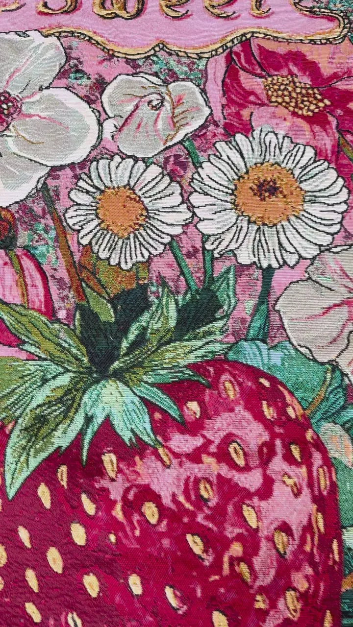
It is not a controlled experiment comparing two palette sizes. The artwork and woven reference demonstrate why a material review is a separate step; they do not establish a general conversion formula or an achievable colour count for another project.
The tapestry development page shows that particular application. A bag fabric, decorative chenille or another jacquard route may require a different evaluation, even when the starting artwork is similar.
What should the final review decide?
The colour-reduction review should decide which essential features remain readable, which simplifications are accepted and which need revision. Record those choices against the exact artwork version. Confirm any effect on production cost, sampling or quantity separately for the proposed route.
For selected small-batch developments, the low-MOQ page provides a related enquiry route. It does not make every artwork or colour combination eligible for the same minimum.
Send the original file, revised file, intended dimensions and annotated change map through WhatsApp RFQ. Tell us which details are essential and which can be simplified. That lets us discuss a meaningful next sample instead of guessing what “keep the same look with fewer colours” means for your design.


